cloud elements - Doc site redesign
problem
Cloud Elements currently has 9 different sources for documentation materials. This includes including guides, FAQs and much more. This often makes a users first API integration with Cloud Elements challenging and time consuming. Users are currently unaware of where to go and what to do on the site.
Overall, this leads to a lower conversion rate of new customers as well as a lower percentage of users successfully utilizing all of Cloud Elements capabilities.
Cloud elements is an API integration platform featuring a catalog of over 150 pre-built connectors, or Elements. Elements allow users to set up integrations that allow software platforms to communicate. Each integration is unique and Cloud Elements aims to make the process as straightforward and seamless as possible.
Cloud Elements tasked us with taking a first time user from a “novice to a ninja” in under 60 minutes. Here’s how we did it.
Tools
Sketch | Invision | Zeplin
COMPETITIVE ANALYSIS
Clear, searchable and organized documentation is a key resource for any API integration platform. Documentation sites aren’t specific to API integrations and they all aim to solve problems for users. Highlighted below are three documentation sites. Their delights and pain points have been highlighted.
The sticky global search and the three column layout were delights for Bootstrap. The main pain point is that the right hand nav lacks indication of a users location on the page .
White/grey contrast and the symmetrical three column layout are both visually stimulating and appealing. No search bar is a big pain point however.
Right side navigation uses color to indicated your location on the site. The left hand nav however is cluttered and the icons are unnecessary.
Persona
After gaining a deeper understanding of the documentation site landscape, the next step was to better understand our user. This was done through the creation of a developer persona, Eric.
Eric is proficient in multiple coding languages and has a great understanding of his company as well as the industry as a whole. A Product Manager has just purchased Cloud Elements API integration software and Eric is tasked with getting it up a running. He needs to do so as quickly as possible and he needs to make sure he maximizes his companies spend.
With that in mind, a heuristic evaluation was conducted in addition to mapping of the existing site’s layout. There was a general lack of consistency regarding the sites navigation and the sites global navigation didn’t prioritize the most important pages.
Journey Mapping
Below you will find a graphic detailing two possible journeys through the site. This graphic looks at the experience Eric would have on the current documentation site compared with the experience he should have. The redesigned version of the site was built with the intention of achieving the journey shown below.
User journey
After taking a look at the competitive landscape, gaining an understand of who the site is being redesigned for, compiling the entirety structure of the current site and understanding what a good and bad doc site experience looks like, a redesign of the sites information architecture began. The main focus of the redesigned architecture is to have an obvious starting point, clear navigation and guidance, scan-able content and an overall straightforward layout.
Wireframes
Wireframes were designed next and user tested with internal developers, UXers as well as external developers based on the previously conducted and now synthesized researched. A symmetrical, 3 column layout to improve hierarchy, new global search and navigation, as well as an element catalog redesign were the key changes tested.
Home Version A - Users preferred this more traditional layout over the more visual B version
Home Version B
Version A
Version B - Users preferred this version, stating that key information should be bolded, not highlighted
Version A - Users said the three column layout should be kept in lieu of the larger icons in version B
Version B
Mockups
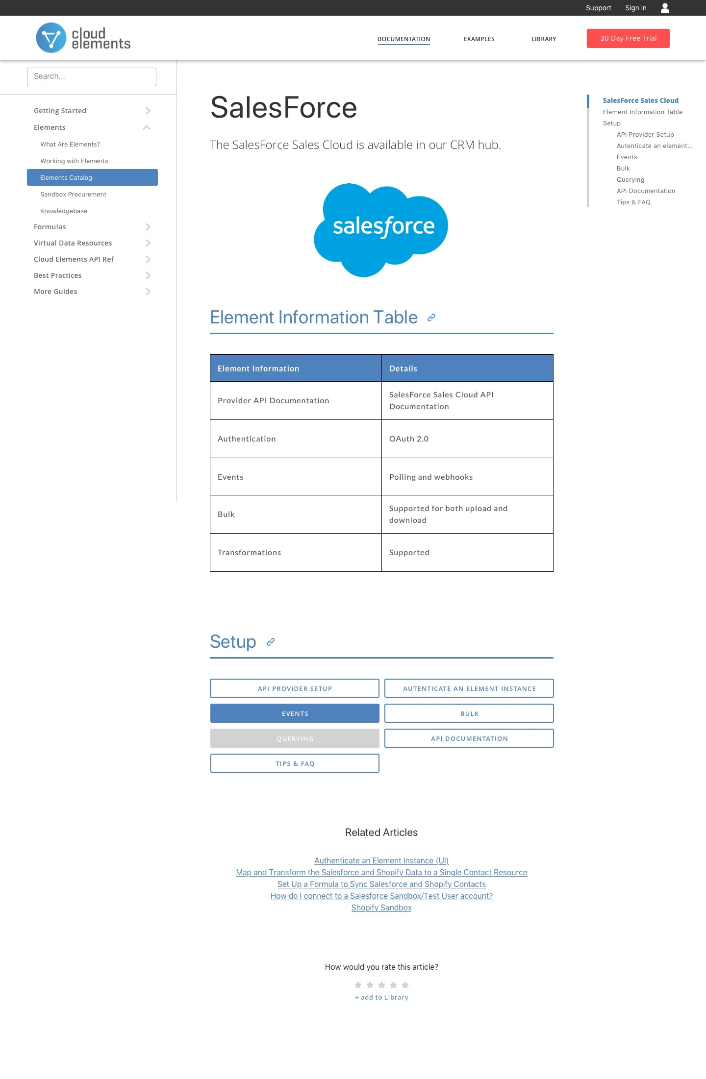
Upon the completion of AB testing, tweaks were made. This lead to the creation of the high fidelity mockups shown below.
Next Steps
With design completed from the UX side, the project was handed of to the development team for implementation, you can view their progress here.
Next steps will be to utilize site traffic data and analytics to determine the effectiveness of the new site. An interactive infographic was also pitched to the Cloud Elements team, it’s something that will be implemented when the team has the bandwidth to do so.
A personalized version of the doc site was also pitched. This would allow users to have a company login with access to a shared library of bookmarked content as well as social features that help build a collaborative community of Cloud Element users.


